If Worshipers Can’t Find You, You’re Not “Welcoming:” Do A Website Audit

Not again!

I heard a passionate minister talk excitedly and with great pride this morning about his new congregation, so I went to the congregation’s website to learn more.

What I learned is that, if I wanted to worship with his community I would have no idea where to go.

The website has all sorts of lovely words about welcome. It has a nice mission statement. It says, “Visitors, we want to know you!” in all verbal ways.

And yet the front page of the website lists only a mailing address. The site informs me that the congregation is in the midsts of a sanctuary renovation, but nowhere does it say if the project has been completed. I clicked and clicked in vain. One of their site pages was updated in November of 2011. No here there, and no address listed even if I wanted to take a chance on driving to an old address. Another site page about the sanctuary renovation was last updated in 2012. Still no street address.

Nowhere on the site does it specify the location for worship in 2013. Sermon titles are listed, speakers are announced. There is a whole page announcement by the leadership inviting input about when to hold summer services.

But WHERE? WHERE will you be holding summer services?

If the information is on the website somewhere, it should not take a seeker more than one click to find it.

Some tips for church websites:

Your congregation’s first page should have the street address of your worship space so that people looking you up on mobile devices (which is a huge majority of your potential visitors) can input your address into their GPS device. A Google map link does me no good if I’m in the car or have decided at breakfast that I want to come to church. A list of driving instructions is fine, but give me both.

Your congregation’s website should identify the year on the front page. As a frequent traveler, I can’t tell you how many times I’ve shown up to an empty building for a community event that was held the previous year. That hurts.

More images, less text.  Unless you worship a building (hey, we all know a few “Churchitarians,”) don’t feature a solo photo of a building on your front page. A congregation is people. And they should look engaged. And the photos should be good.

But more than anything, and right away, for heaven’s sake let people know where you are.


Steam and Chill: Feeding The Community In a Beautiful “Third Place”

I was in St. Pete Beach, Florida a few weeks ago at a clergy gathering and went out one morning to see if I could hunt down a good latte. My eye caught the sign for Steam at the side of the road. The font — yes, the FONT on the sign — communicated “hip, progressive, fun” so I pulled over and into the parking lot.  When I saw their tag line, “Sharing common grounds,” I knew I had found my “third place” in St. Pete Beach.

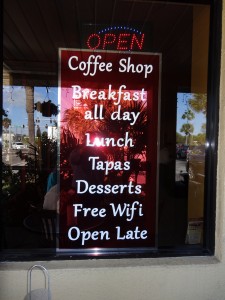
This is the sign on their door. It communicates a generous spirited welcome.

Breakfast all day. Free wi-fi. Open late.

Doesn’t that feel so much different than “Hours of Operation” or “No shirt, no shoes, no service” or “Please use the other door?” What does the front door of your building say? What does it communicate?

The interior of the place was warm, funky, and inviting with a womb-like color scheme. The server and the staff were extremely attentive and friendly and seemed to genuinely care whether or not I was happy with my latte. I was very happy with my latte. That’s a beautiful latte. It was also delicious.

I was very happy with the whole situation! And so Steam and Chill (the tapas restaurant the space becomes at night when it switches to dinner) became my home away from home for the few days I was in Florida. I ate every meal there. Isn’t that what you want people to feel about your church? and I spent hours talking to owner Ruthie Buxbaum one morning. She’s very special.

There’s never a rush at Steam. Ruthie’s menu says, “The philosophy of Steam and Chill is this: if you were planning a big party at home for very special guests, you would clean up all day. You would shop carefully for each ingredient & find the freshest produce possible. You would greet your friends warmly with enthusiasm. You would cook each item carefully and decorate it gently. You would be grateful to cater to their every need. … Then you would give each one a warm goodbye. And, if you’re blessed, they will come again. So, sit long, talk much, and laugh often.” This is a mission, people! On a menu! Is your church’s mission that loving, generous and explicit?


That’s the coffee bar and below is the tapas bar. Lots of fun to sit there and watch the chefs create the gorgeous dinner plates. I wound up having a wonderful conversation with a couple from Missouri one night over dinner and meeting them back for coffee the next morning. That’s my version of “picking people up at a bar.” They were wonderful, fun people and I am hoping that they’ll visit a Unitarian Universalist congregation when they get home. They had never heard of us and didn’t know there was a religious community in their area where they would be welcomed as liberal atheists.The cheese grits and eggs with andouille sausage was heavenly. Again from the menu, “Life always seems to happen in the kitchen. We find the Language of the Heart is often shared when we break bread together. So, know that we will strive to serve you with love & gratitude.”

And from the last phrase, “We are so grateful to welcome you to Chill.” A beautiful mission, delicious, healthy, affordable food, and a lovely space. An altogether inspiring enterprise and I feel very lucky to have discovered this little gem.

Steam and Chill specialize in vegetarian and gluten free dishes. Thanks to Ruthie and her family for nourishing me body and soul. My most sincere blessings to you as you continue to feed the community.

Integrating Image and Mission: St. Paul’s Hammersmith

I was walking in London one afternoon and fell in love with this old church’s striking signage:


What works? The grey color, for one. It communicates city smog and London fog but not in a dinghy or depressing way. The white lettering is bold and contemporary — thank GOD, because if I see another church sign in bad Gothic font I’mma lose it.  The logo is also refreshingly contemporary: look, Ma, no cross!! The thumbprint on the cityscape is far more evocative and interesting to contemporary seekers who have already seen so many crosses in their lives they’ve formed firm opinions about its meaning and whether or not it welcomes them.

And what a slogan, huh? “Shaped by God to shape the city.” Bam. Before I even attend my first service there, I know that this church feels called to connect to its community, and I love that. Then, because I’m a tourist and I might not have the nerve to walk in the door but I’d like to know something about this congregation, I’m psyched to see…

The website, the Twitter feed and the church phone number right there on the sign. Just standing there on the street I can pull up the information I’m looking for on my phone and learn more about the congregation and its programs.

Very cool.